Revamping the Projects Screen to Support a Growing Platform
Industry
Market Research - AI
Client
Forelight.ai
Service
Product Design
Date
Q1 2025
Project Overview
Context
When I joined Forelight, the platform primarily offered a single core functionality: extracting insights from video interviews. However, the product lacked a cohesive structure, causing scattered research findings and difficulty managing insights. Users consistently struggled to organize their projects and frequently became confused navigating through multiple research activities.
One of my initial responsibilities was designing the original "Projects" screen, which grouped interviews and insights by project. This quickly became the central interface for initiating, organizing, and managing research projects.
Initial “Projects” Screen:

Two years later, the platform evolved significantly, adding advanced features like AI Moderation, participant recruitment management, collaborative tagging, and extensive data visualization dashboards. Despite these advancements, the "Projects" screen remained largely unchanged, becoming overloaded, visually cluttered, and challenging to use.
Current (Problematic) “Projects” Screen:
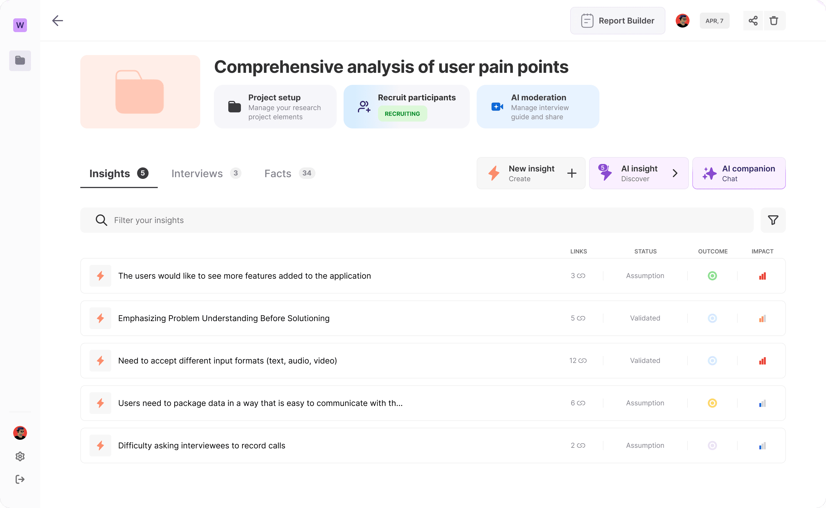
Consequently, users—especially new and junior team members—felt overwhelmed, leading to inefficient platform usage and underutilization of essential features.
Users & Their Needs
User Profiles
Experienced Researchers: These users typically work on multiple, simultaneous research projects. They are power users who expect speed, control, and quick access to insights and relevant project assets. Their needs center around efficiency, clear organization, and minimized friction. They are sensitive to platform inconsistencies and expect a professional, polished interface.
Junior Collaborators: Often invited into a project by more senior teammates, these users are less familiar with the tool. Their pain points are rooted in cognitive overload and lack of guidance or onboarding. They need reassurance from the interface—something that communicates what to do, where to look, and how to contribute meaningfully without formal training.
New Customers: These are newly onboarded teams evaluating or beginning their first research initiatives with Forelight. Their success is critical to product adoption. They need a clear path to action from Day 1, with minimal effort to reach their first win (e.g., uploading interviews, creating tags, inviting teammates). If not guided properly, they are likely to churn.
User Needs
All user segments required a clear, intuitive project organization system, simplified navigation to essential features, reduced cognitive load, and improved performance for faster interaction. Each needed contextual guidance and the ability to access relevant tools based on their unique roles, experience levels, and goals. All user segments needed a clear, intuitive project organization system, simplified navigation to essential features, reduced cognitive load, and improved performance for faster interaction.
Problem Definition
❌ Key Pain Points
Information Overload: Excessively cluttered interface.
Poor Hierarchy: Difficult navigation due to lack of structured information.
Onboarding Challenges: Unclear pathways for new users to engage effectively.
Feature Underutilization: Critical features like recruitment management were overlooked.
Performance Issues: Slow loading times due to technical inefficiencies.
💬 Real User Frustrations
“I don’t know where to start when I land on this page.” — Market Researcher, new user
“I always have to explain the dashboard to my teammates before they can use it.” — Lead Researcher
“There are too many things on the screen; I’m scared I’ll break something.” — UX Researcher, junior
“I just use the AI Companion. The rest is too complex.” — PM, occasional user
UX Research
Research Methodology
I independently conducted:
Detailed interviews with 16 diverse participants
Extensive analysis of customer support tickets
Behavioral analysis using platform analytics
Heuristic evaluation to identify usability issues
❌ Research Insights
Interface did not scale with user needs
Lack of clear onboarding increased cognitive load
Essential features were regularly unnoticed
Junior users depended heavily on senior colleagues
Ideation & Design Exploration
Flow Mapping & Wireframes
To avoid designing in isolation, I began by mapping out flows based on actual behavioral data and common user journeys. I created multiple entry-point scenarios such as:
A senior researcher creating a project from scratch
A junior team member joining an ongoing project
A new user invited to explore the platform without prior onboarding
Each flow considered contextual user intent, relevant features to expose (e.g., AI Companion, Tagging, Recruitment), and moments where friction typically occurred.
Once aligned with the product team, I converted these flows into mid-fidelity wireframes that emphasized hierarchy, progressive disclosure, and clear CTAs. Special care was given to distinguish “active” vs. “informational” components, and to guide the eye through the screen logically without overwhelming users.
We also explored multiple structural layouts—including vertical scroll vs. modular grids—to ensure the layout would scale with future features.
UI Concepts Explored
Evaluated multiple layout concepts, including:
Traditional lists
Card-based layouts
Modular grid structures
Solution & Design Decisions
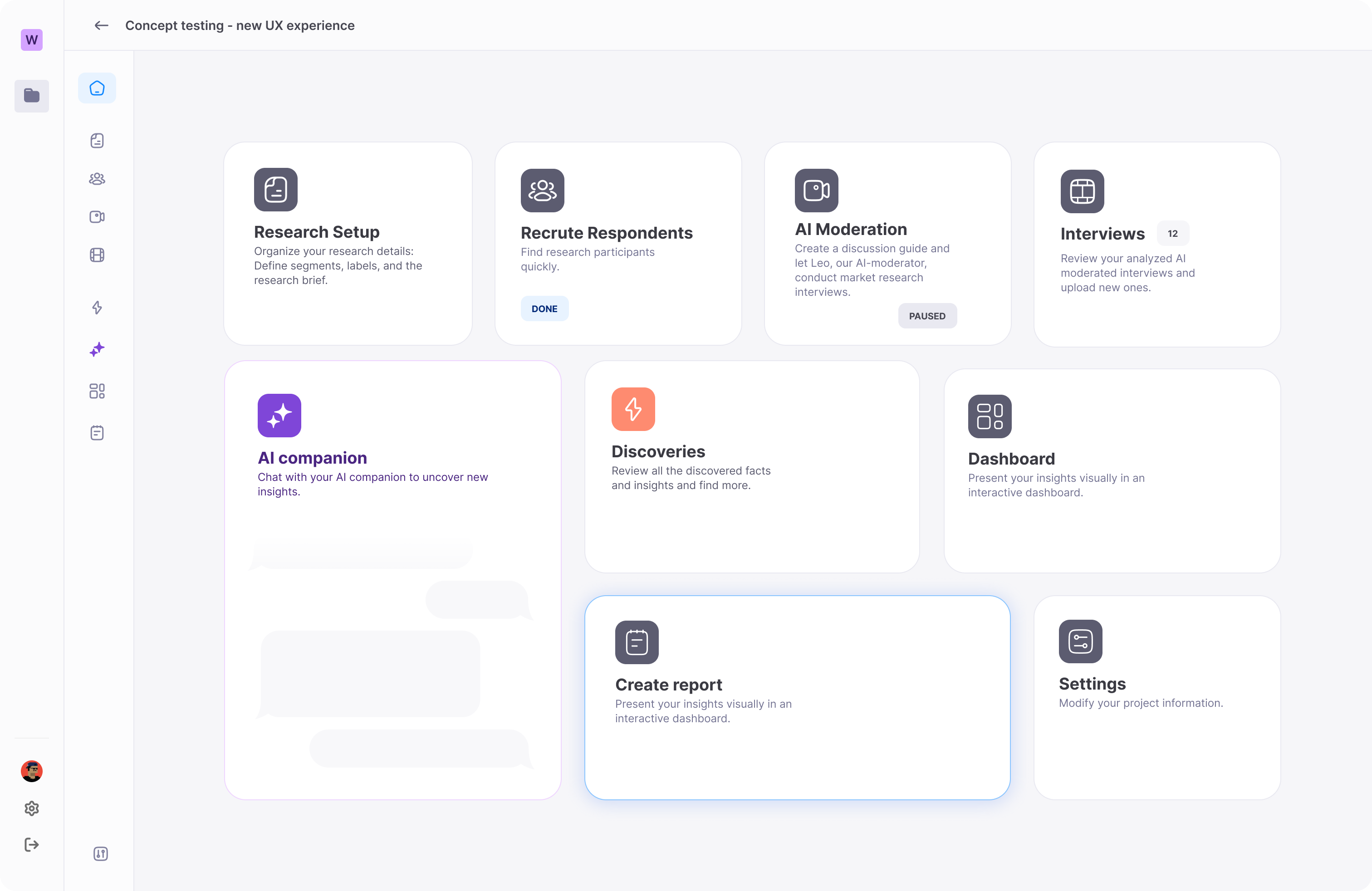
💡 Final Concept: Bento-Style Dashboard
I chose a Bento-style modular layout for its flexibility, scalability, and clarity. This design allowed for clear content separation and dynamic adaptability to user roles and project states.
💡 Key Features Implemented
Modular content cards for structured information
Context-driven, step-by-step project setup
Progressive disclosure to reduce cognitive overload
Prototype & User Testing
Prototype Development
The final wireframes were translated into an interactive Figma prototype that simulated core paths from project creation to team collaboration. The prototype incorporated:
Adaptive bento blocks with real content variations
Onboarding guidance elements for first-time users (such as tooltips and inline help)
Multiple states for each card (empty, in progress, completed)
Responsive behavior to emulate real user scenarios
I ensured that the prototype supported a variety of user flows, including edge cases, and worked collaboratively with devs to validate feasibility during early review stages.
The prototype was not just a UI demo — it was a functional representation of how the new screen would reduce onboarding time, highlight critical features, and support long-term research organization.
Testing Strategy
Extensive testing was conducted with:
Experienced researchers
Junior collaborators
New and non-users (for onboarding validation)
✔ Testing Insights
The usability testing sessions provided rich qualitative feedback and clear signs of success across all user groups.
Experienced researchers found the new modular layout intuitive and appreciated how it allowed them to quickly access specific parts of a project without navigating through clutter. They were able to transition from the old version with minimal friction and reported increased efficiency during daily workflows.
Junior collaborators expressed that the new onboarding flow was a game changer. The progressive disclosure of features and visual cues within each bento card helped reduce anxiety and confusion. Several mentioned that they felt confident navigating the platform without external help for the first time.
New users, especially those testing the product for the first time, reported a much faster time to first action. They appreciated how the screen now guided them naturally through key actions like uploading interviews, tagging insights, and inviting teammates.
The layout also underwent tests for information hierarchy, visual clarity, and discoverability, all of which received high marks. In particular, cards related to recruitment and AI moderation—which were previously overlooked—saw a significant increase in visibility and interaction during testing.
Overall, the tests validated the core design decisions and demonstrated that the new structure not only improved usability, but also unlocked more of the product’s value for all user segments.
Development & Delivery
Collaboration with Developers
Throughout development, I collaborated closely with front-end and back-end teams to ensure accurate implementation and smooth integration.
Iterations & Adjustments
Continuous iterative feedback loops with developers refined the design, enhancing technical feasibility and optimizing user experience incrementally.
Results & Impact
New Redesigned “Projects” Screen
▶️ Test the prototype yourself!
Beta Launch Outcomes
The redesigned "Projects" screen received immediate positive feedback in beta. Users quickly adapted, reporting enhanced clarity, easier onboarding, and increased use of key features. Stakeholders praised the modular design, acknowledging significant improvements towards a scalable and intuitive user experience.
Learnings & Future Improvements
✔ Lessons Learned
This project highlighted the necessity of proactively managing UX debt to maintain optimal user experiences. The modular design clearly demonstrated scalability's role in enhancing user engagement and satisfaction. Additionally, it emphasized the importance of providing context-specific guidance tailored to various user profiles.
Next Steps
Ongoing data collection and user feedback will guide continuous iterative improvements, ensuring the platform evolves sustainably to meet user needs effectively.